An S-Curve plots cumulative progress over time; the period histogram shows how much work falls in each period. Schedule Pro draws both from your schedule — planned, actual, and forecast — sharing one cut-off date and one set of units so periodic and cumulative views read together.
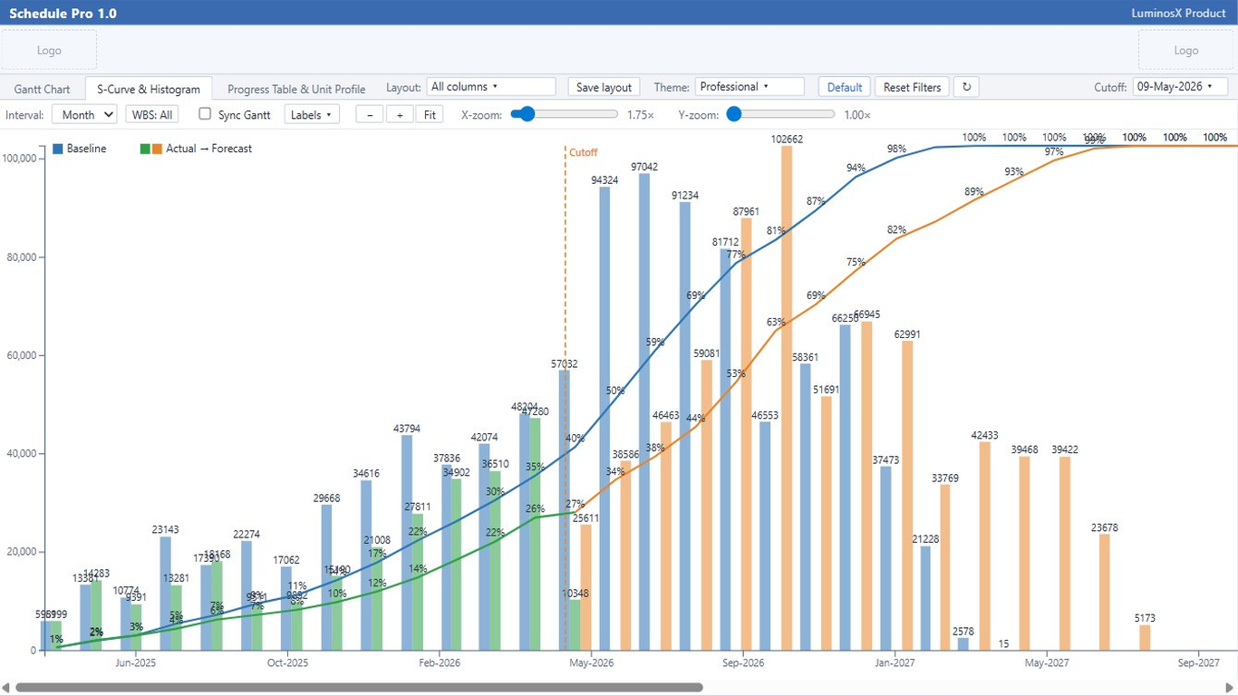
Three cumulative curves on one chart make schedule performance obvious: where actual sits against plan, and where the forecast lands.
Set the cut-off (data date) that separates actual from forecast. The project default is highlighted in the selection list.
Show the value axis in units or as a percent of total, whichever suits the audience.
Per-point values can sit on the curves; labels are on by default so the chart reads without hovering.
Format the time axis to match your reporting calendar and locale.
Focus the curve on part of the programme by filtering to selected WBS branches, with a searchable picker for large structures.
A clear legend identifies the planned, actual, and forecast series and any histogram bars.
Each period’s workload draws as a bar, turning the schedule into a clear distribution of effort over time, paired beneath the S-Curve.
Compare planned against actual and forecast for each period to spot over- and under-runs early.
The histogram uses the same cut-off as the S-Curve, so actual and forecast bars split at the same data date.
Group by the period that fits the programme and show bar values in units or percent, matching the S-Curve axis.
Per-bar values can sit on the histogram so figures read directly off the chart.