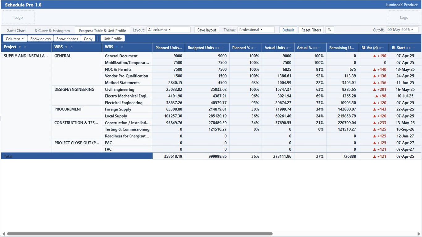
The progress table rolls up planned versus actual progress by project and WBS level. The unit profile extends it with a time-phased view — baseline, actual, and remaining units spread across periods — using the same distribution engine as the S-Curve.
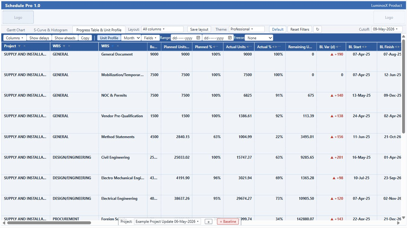
Progress rolls up from activities to WBS levels and the project, so you can read summary or detail at the depth you need.
Each WBS branch carries its own subtotal, with cut-off-aware proration of actuals for accurate period figures.
Planned, actual, baseline-planned, and remaining columns make variance and slippage easy to scan.
Rename columns to match your organization’s reporting vocabulary.
Arrange columns in the order your team reads them; the order persists between sessions.
Set number formats, decimals, and styling per column for clean, report-ready output.
Switch the progress table into a spreadsheet-style, time-phased view. Every row expands into sub-rows that distribute its units across date columns, mirroring the S-Curve’s baseline / actual / forecast spread — so the same numbers behind the curve are readable as a table.
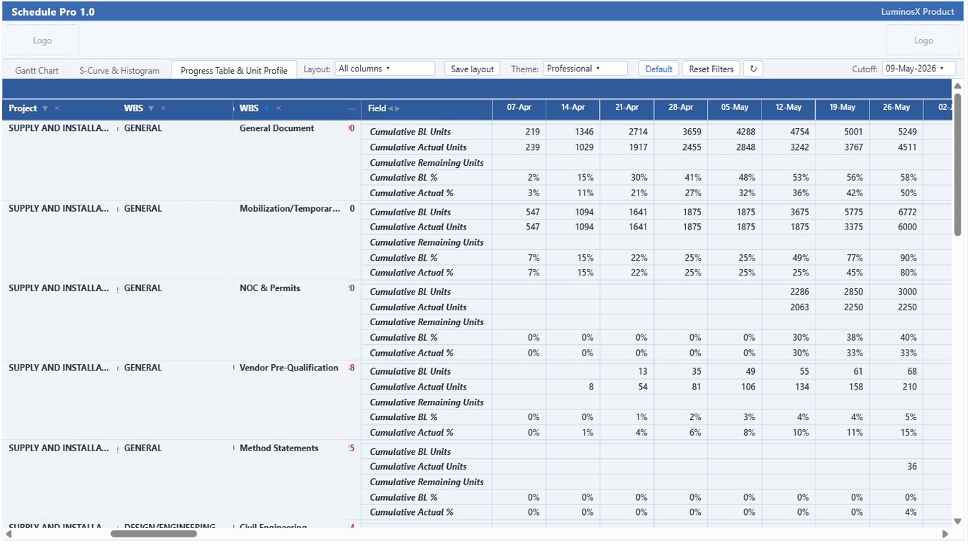
Turn the unit-profile section on from the progress toolbar. Each activity, WBS, and total row gains a time-phased block beneath it.
Three series drive every field: budgeted units spread over the baseline span, actual-to-cut-off units over the actual span, and forecast remaining units over the future span — the exact distribution the S-Curve uses.
Pick from twelve spreadsheet fields — period or cumulative, units or percent of the row’s total, across baseline / actual / remaining. The defaults are Cumulative BL, Actual, and Remaining units.
Choose the interval the unit columns bucket into — so the same profile reads weekly, monthly, or at the period that fits the programme.
Each field reads either per-period or running-cumulative, and as absolute units or a percent of the row’s own total. Cumulative fields count from the first bucket, so a sliced date range still reflects earlier work.
Constrain the visible date columns to the window you care about, and freeze leading columns so labels stay in view while the time-phased columns scroll.